

We work with small businesses, so we know the deal.


Too much to do, not enough time, and marketing always ends up last.
Enter Communion. We make it feel less like a chore and more like something that just…clicks. We keep things personal and honest, not overcomplicated. No handoffs, no bloated process. Just good thinking, good design, great results and a good time.

Who we are

We’re a small team with big-agency experience.
Our favourite work happens close to home, helping local businesses figure it out. We keep things personal. We get involved. We care about the details most people skip.
Good people, good work. That’s the rule.

services
Branding

A brand that makes sense, stands out, and holds up.
Website

Sites that look right, feel right, and do their job so you can do yours.
Copy

Words that sound like you and actually say something.
Social

Content people don’t scroll past.
Search

So the right people can actually find you.
Strategy
A clear plan, minus the overthinking.
Marketing

Everything working together, the way it should.
UX

Simple, thoughtful, and easy to use.

 Recent work
Calgary Rowing Club
 After
After
 Before
The Challenge
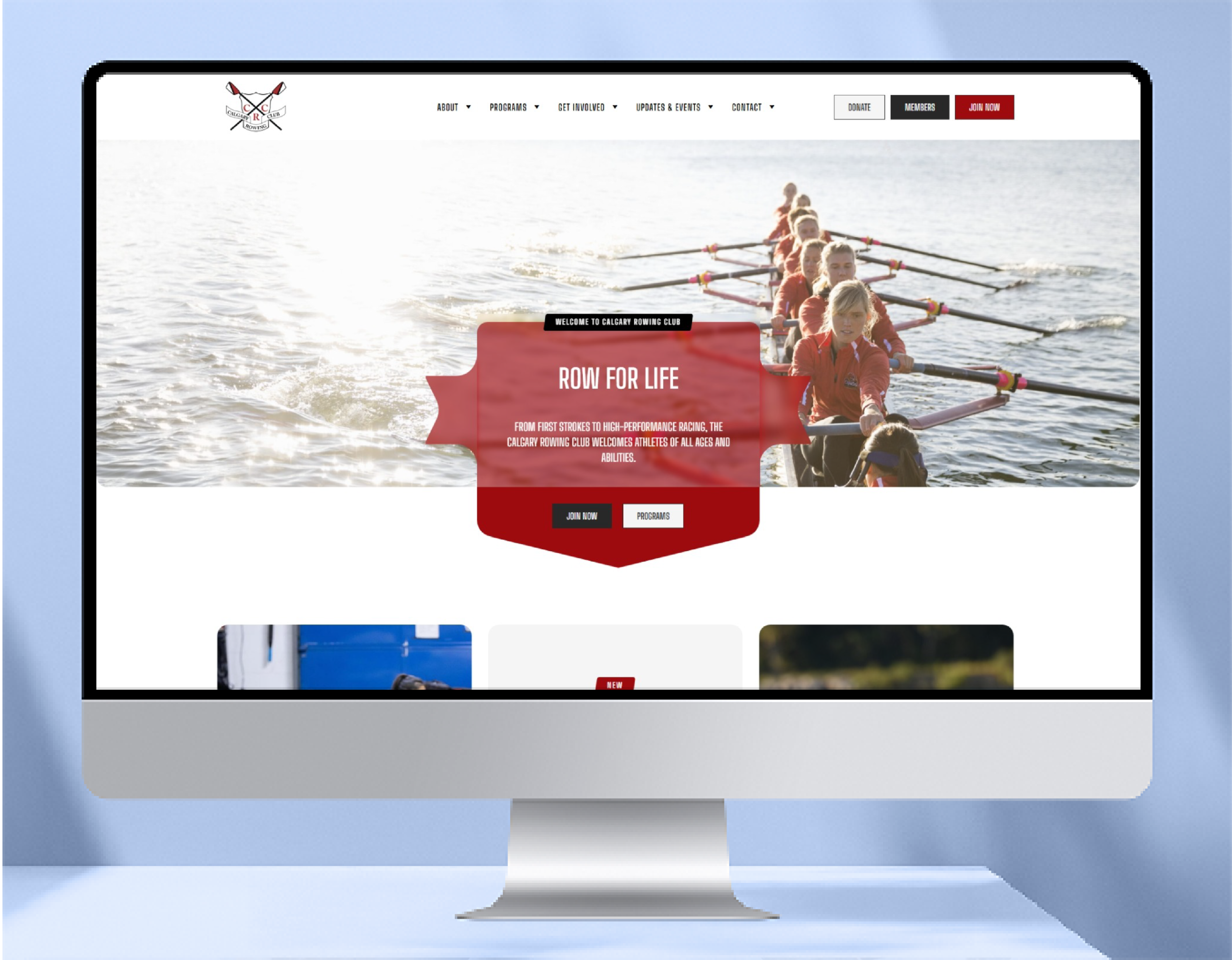
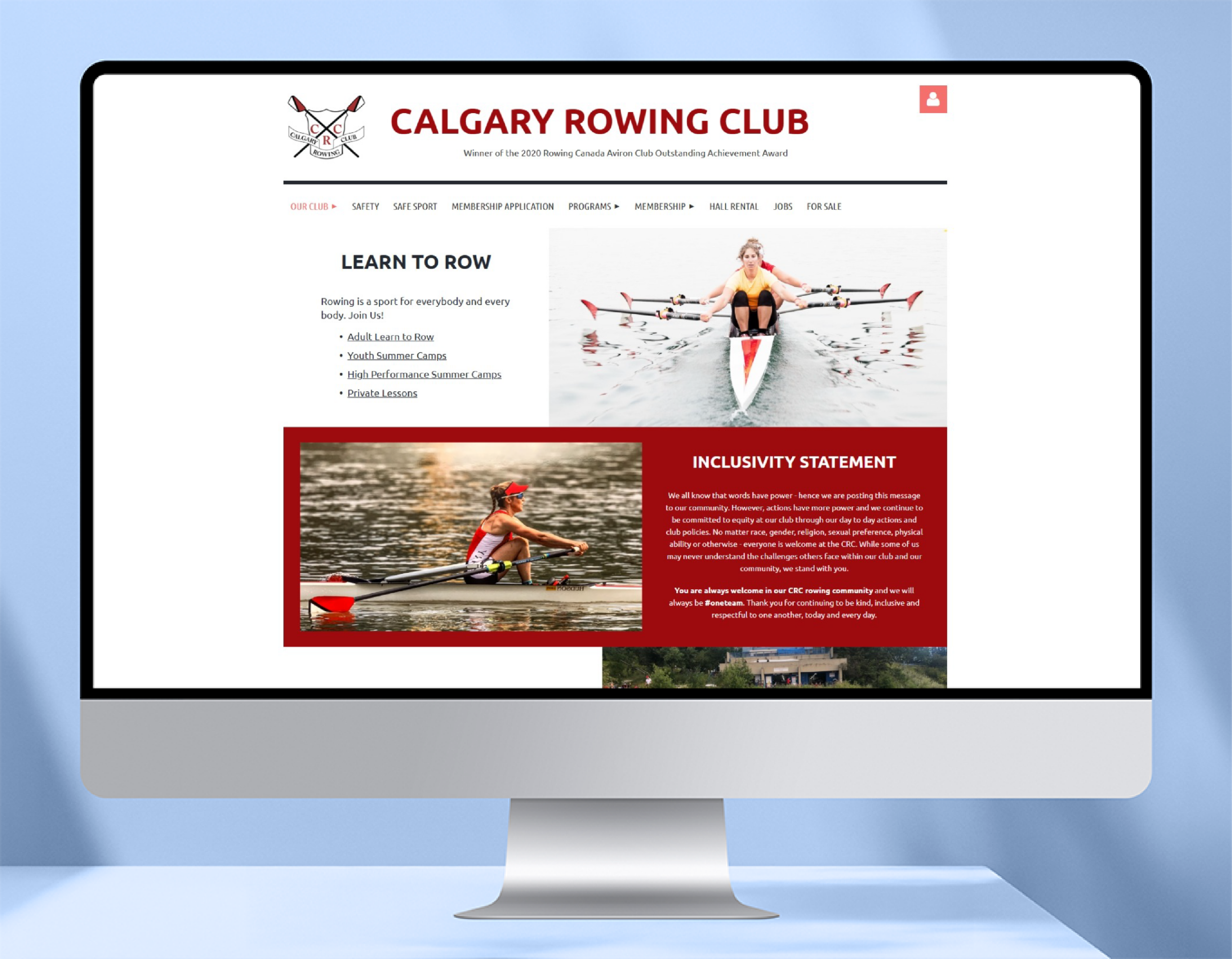
Calgary Rowing Club has been part of the city’s rhythm for decades. But like many member-driven organizations, they faced a familiar challenge: how to stay relevant, grow membership, and communicate their value clearly without losing what makes them distinct. That’s where Communion came in.
The club had built something meaningful, but it wasn’t translating online. Their digital presence didn’t reflect the quality of the experience and newcomers found it hard to understand how to get involved.
The Approach
We simplified the journey, streamlining how new members discover, evaluate, and join by drastically reshaping their navigation and site content and we gave the site a tone of voice, moving away from institutional language toward something more human.
The Outcome
- Increased engagement from first-time visitors
- More inbound interest from beginners, not just experienced rowers
- Stronger alignment between online presence and in-person experience
- Many client tears of happiness
Key Takeaway
You don’t always need a bigger story. Sometimes you just need to tell the right one, clearly.
 Recent work
Clear-Site Solutions
 After
After
 Before
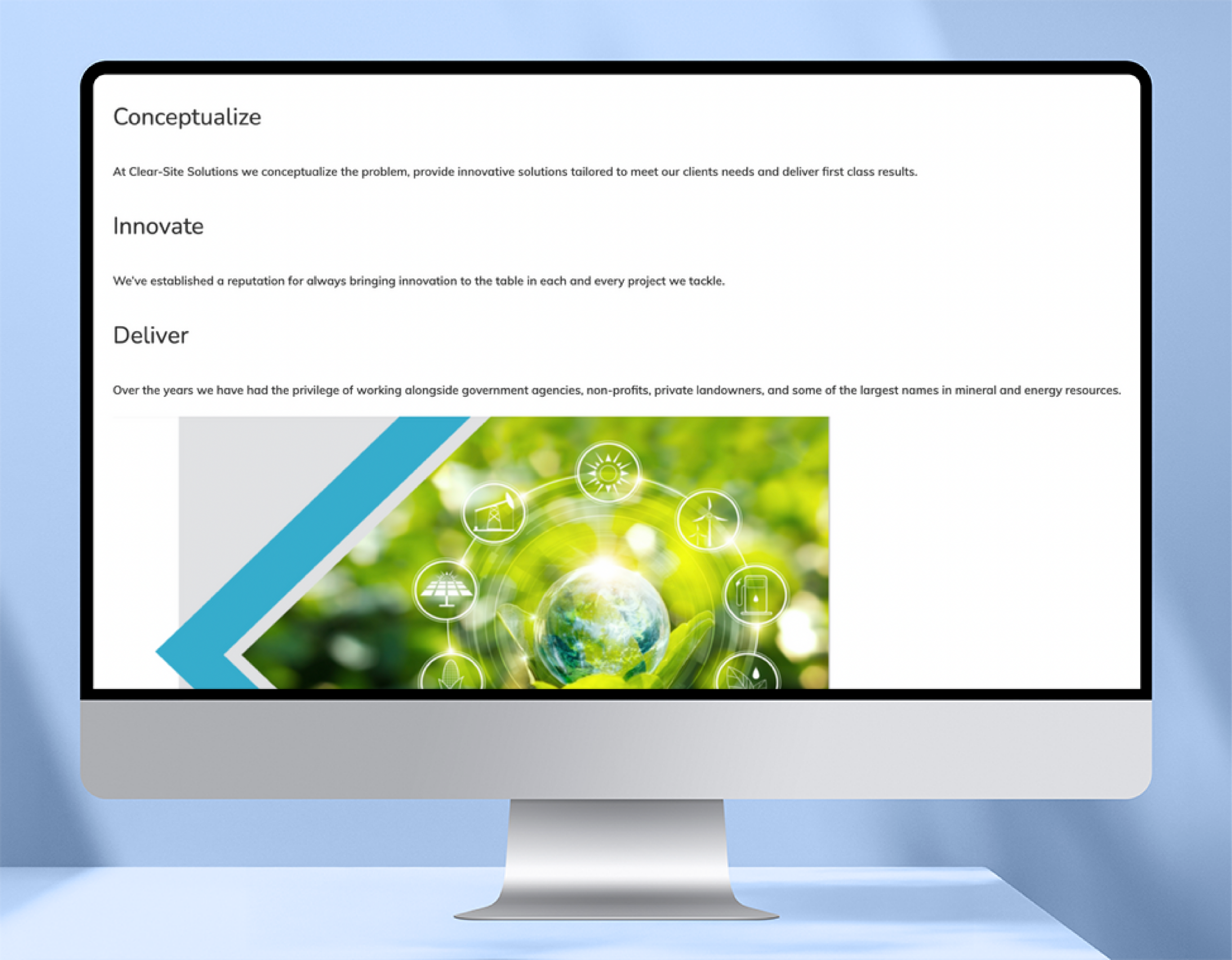
The Challenge
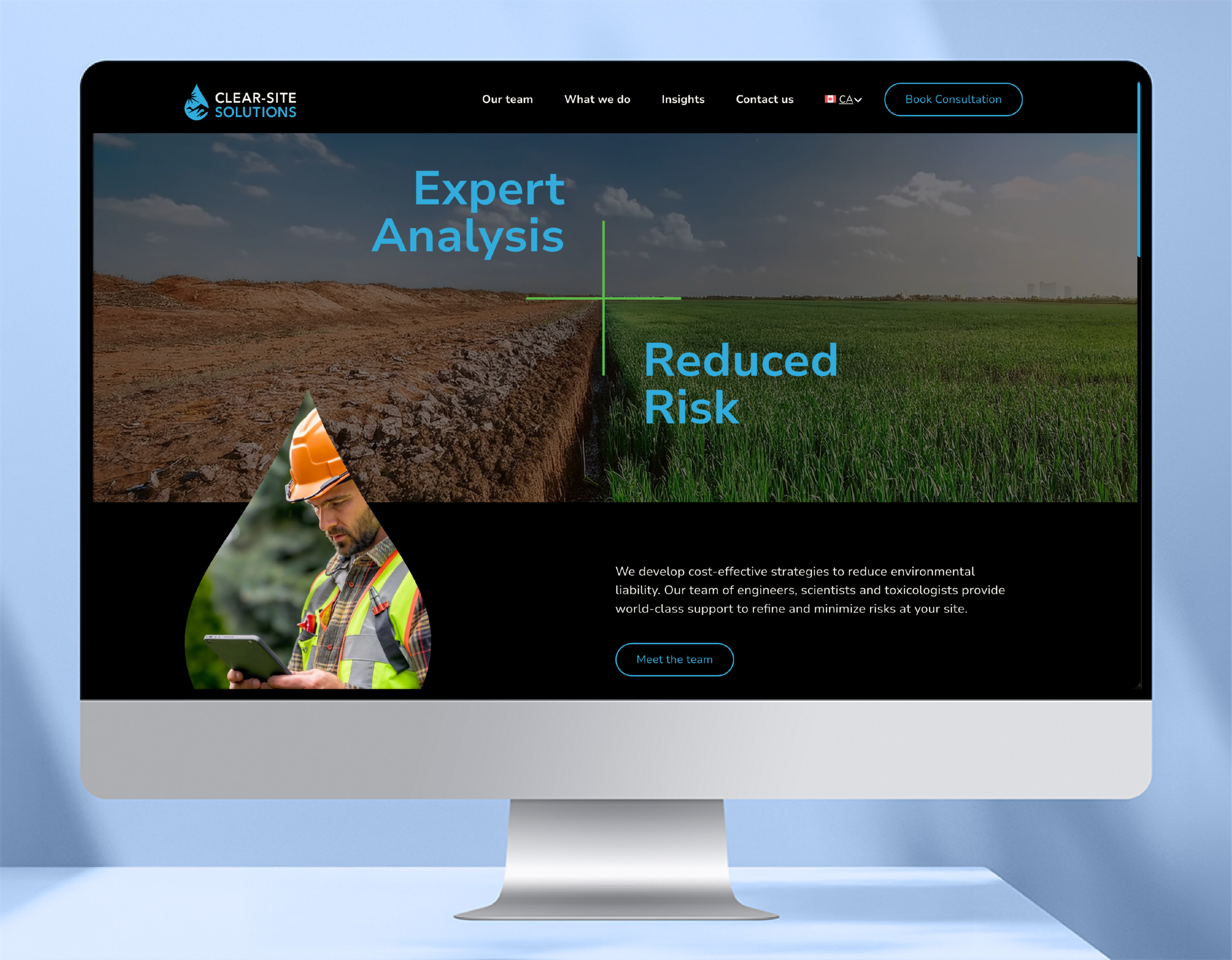
When Clear-Site Solutions came to us, they had a growing business, multiple service lines, and no unified brand to bring it all together. The challenge wasn’t just creating a website. It was creating a foundation. As the company expanded into distinct business units, they needed each division to stand on its own while remaining unmistakably part of the same organization. The brand needed to be credible, scalable, and flexible enough to support future growth.
The Approach
We created the Clear-Site Solutions brand from the ground up, establishing a visual identity, messaging framework, and design system that could scale across multiple divisions. Rather than treating each business unit as a separate entity, we developed a family of brands. Each division has its own identity and audience focus while remaining connected through a shared visual and strategic framework. We then designed and developed three websites, each tailored to its specific audience and business objectives, translating technical services into clear, accessible language that speaks directly to customers.
The Outcome
- Increased visibility through SEO-focused site architecture and content strategy.
- A recognizable brand presence across digital channels, proposals, trade shows, and industry events.
- Clear differentiation between business units while maintaining a cohesive parent brand.
- A scalable platform designed to support future growth, funding opportunities, and new service offerings.
Key Takeaway
A professional brand presence isn’t a nice-to-have. When every touchpoint works together, organizations earn trust faster, compete more effectively, and strengthen the business as a whole.
 Recent work
Meow Foundation
 After
After
 Before
The Challenge
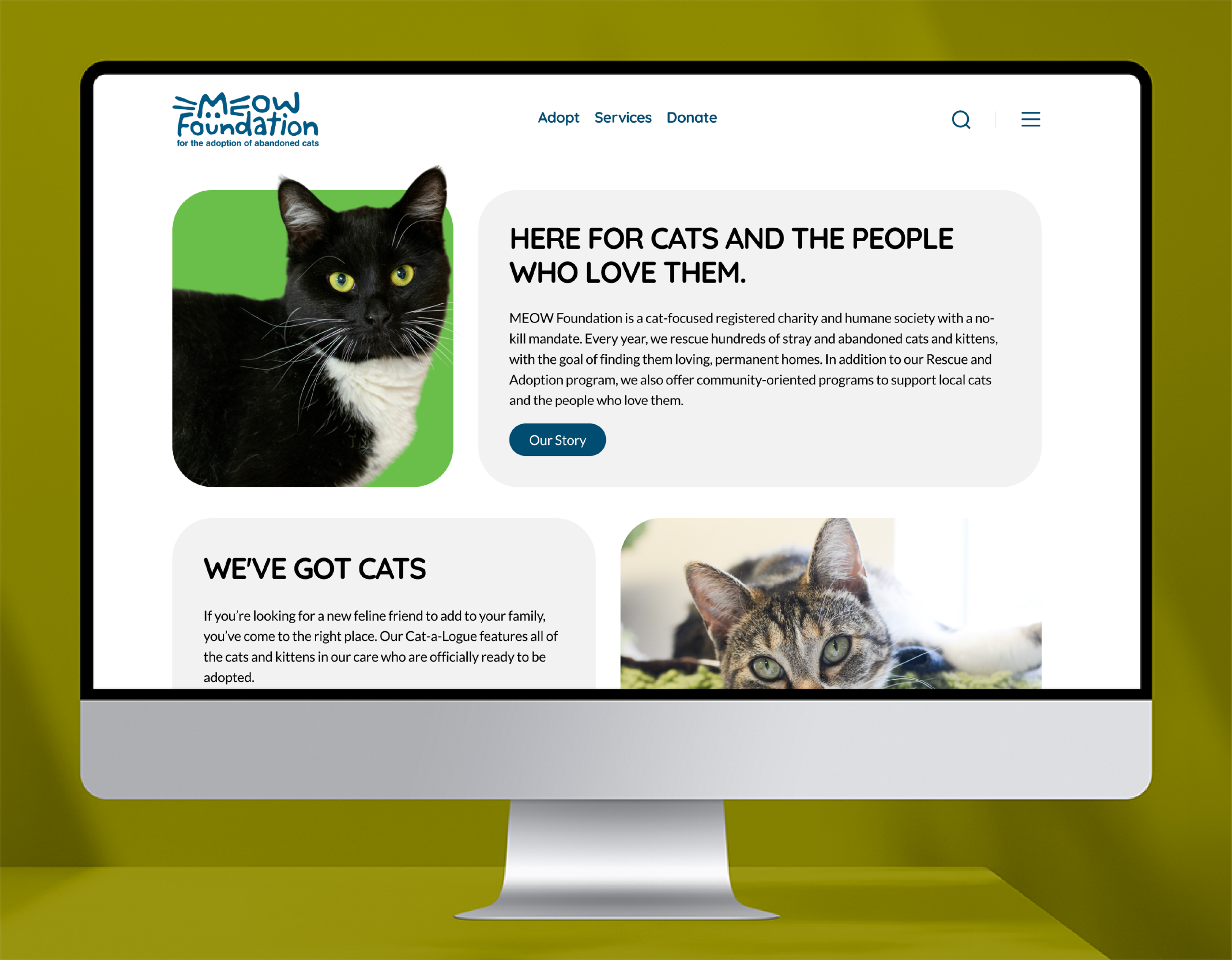
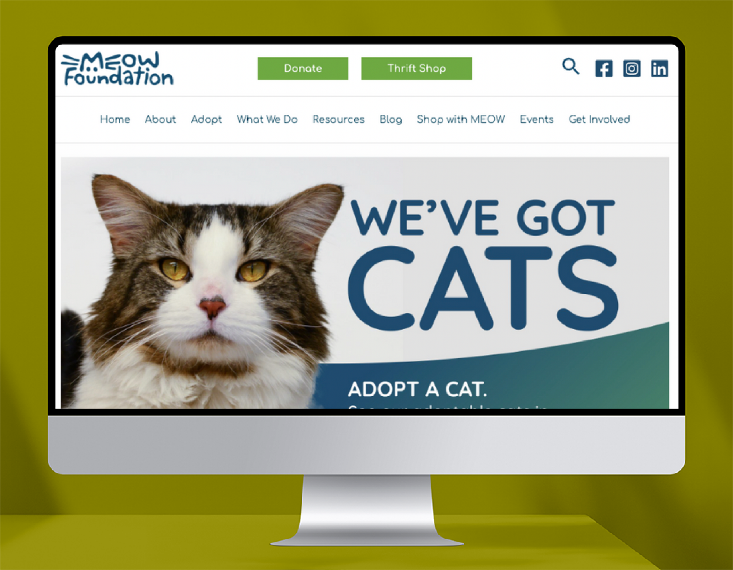
MEOW Foundation has a clear mission: rescue cats, find them homes, and reduce overpopulation through spay and neuter programs. The work was strong. The digital experience wasn’t. The website had grown over time as many hands added more information, burying business objectives and key calls to action.
The problem wasn’t awareness. It was focus. Too much content competing for attention. Core actions buried beneath secondary information. Inconsistent brand expression across pages. Users unsure where to go or what to do next.
The Approach
We introduced a more cohesive, modern identity with cleaner typography, warmer tone, and imagery. We clarified their digital objectives, reduced site content and then rebuilt around what matters. We aggressively culled content to ensure anything that stayed laddered back to business objectives. Each primary action has a direct path meaning fewer decisions, clearer next steps. And we made it fun. Cat lovers love cats.
The Outcome
- Increased engagement on adoption and donation pathways
- More direct traffic to spay and neuter resources
- Shorter user journeys to key actions
- A stronger, more consistent brand presence
Key Takeaway
Clarity is a force multiplier. When every element supports a defined outcome, impact follows.